
Apple manufactures a decent variety of hardware, but the iPhone is perhaps its most popular product. Each year, we see the launch of a new iPhone, with spec bumps, camera improvements, and sometimes even new hardware inclusions like the Camera Control feature. We don’t see Apple experimenting a ton with the design, but given how the iPhone has one of the best displays and camera systems in existence, there probably is no need for design overhauls every generation.
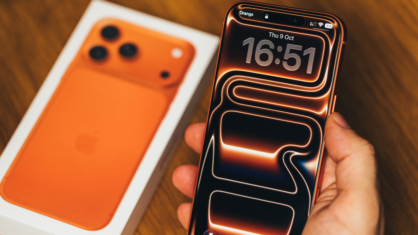
All current smartphone models in Apple’s lineup, except the iPhone 17e, boast a Super Retina XDR OLED display that can hit refresh rates up to 120Hz thanks to ProMotion. Besides the now iconic Dynamic Island, the screen goes to the very edges and makes for a great multimedia experience. Apple’s advertising doesn’t shy away from highlighting this aspect of the iPhone. In fact, the default wallpaper that the iPhone 17 ships with shows off the display’s vibrancy and rich contrast quite well. The iPhone 17 Pro series, however, takes things a step further.
Unlike the base iPhone 17, which uses a color-matched floral burst pattern, the Pro models feature a more abstract aesthetic. The default wallpaper is still color-matched to the iPhone’s body color, but you’ll notice a stronger emphasis on depth and refractions — likely as a reference to iOS 26’s new Liquid Glass design. If you look even closer, though, you’ll realize the abstract wallpaper actually spells out the word “PRO.”
Other Apple devices with clever wallpapers
Now that you’ve seen how your iPhone 17 Pro’s wallpaper cleverly uses its abstract elements to spell something out, we apologize if you can never look at your lock screen the same way again. Apple actually uses this kind of visual trickery more often than you think. For instance, the iPad Pro also uses a very similar wallpaper to advertise its product name. The iPad mini’s ribbon-style wallpaper spells things out a little more obviously. That said, it’s a lot harder to spot the word “AIR” in the iPad Air’s wallpaper.
The newly launched MacBook Neo comes in a few fun colors, and the color-matched wallpaper spells out “MAC.” Similarly, the iMac, MacBook Air, and MacBook Pro computers also use layered shapes, abstract elements, and even negative space to subtly embed their product classes into the wallpaper. There are a few outliers in Apple’s catalog that don’t have hidden letters in their wallpaper — so you’re not crazy for failing to spot the same pattern in the base model iPhone or iPad.
You obviously don’t have to use your Apple product with the default wallpapers they ship with. Both iOS and macOS have other collections you can pick from — or you can always select a photo of your choice from your gallery. There are also several great wallpaper apps for the iPhone that offer an endless selection of high-quality images.
